
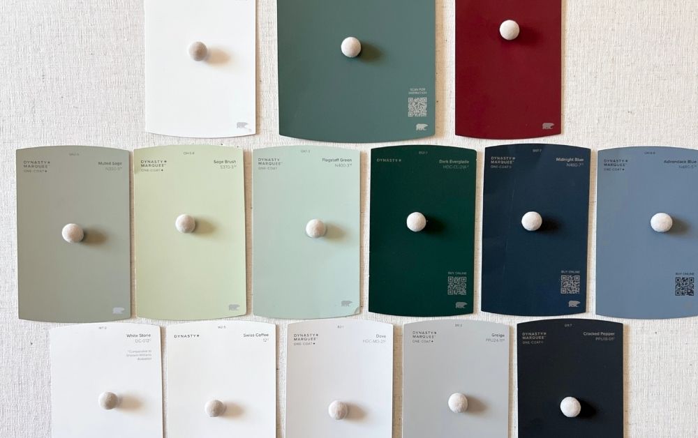
In this guide, I’m sharing the most popular Behr paint colors, including Blank Canvas, Swiss Coffee, and Creamy Mushroom, with real comparisons and undertone explanations to help you choose confidently.
Most of the time, Behr just makes more sense for how I actually work on projects. I can grab paint, tools, and supplies in one stop instead of making multiple trips, and the color range is big enough that I don’t feel limited or pushed toward pricier brands. Samples are affordable, so testing a few options doesn’t feel like a commitment.

Go straight to
- Paint color doesn’t change, light does.
- Before You Pick a Paint Color, Test It in Your Space
- Behr White Paint Colors
- Behr Neutral Paint Colors
- Behr Blue Paint Colors
- Behr Green Paint Colors
- Behr Color of The Year
- How to Read the Color Chip
- FAQ
- What Actually Matters When Choosing Paint
- More Painting Projects and Tips
Disclaimer: This page may contain affiliate links. If you click on one of these links and make a purchase, I may receive a small commission at no extra cost to you. I only recommend products and services that I believe will add value to my readers. See our full Affiliate Disclosure at this link.
Paint color doesn’t change, light does.
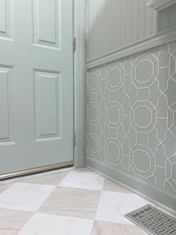
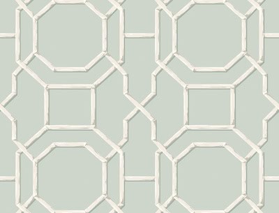

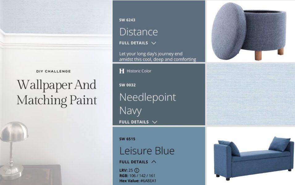
Home Depot’s color matching makes it easier to match pricier brands. I really struggled matching the wallpaper in this room with ZERO natural light. I used this Peel and Stick Wallpaper. Home Depot scanned the wallpaper and because of the lighting in the room the blue tone matched much better.
Before You Pick a Paint Color, Test It in Your Space
Paint colors can look completely different from the tiny swatch at the store. Before committing to a color, I always recommend testing your top choices in the actual room. Look at them in the morning, afternoon, and evening, and pay attention to how your lighting and surrounding finishes change the color.
This is where peel-and-stick samples are so useful. You can move them around the room instead of painting several test patches on the wall.
Before committing to a Behr color, I recommend testing the most popular paint colors from Benjamin Moore and Sherwin Williams using peel-and-stick samples. This makes it easy to compare undertones in your actual lighting.
This is the easiest way to avoid choosing the wrong white paint color.
Popular Behr White Paint Colors
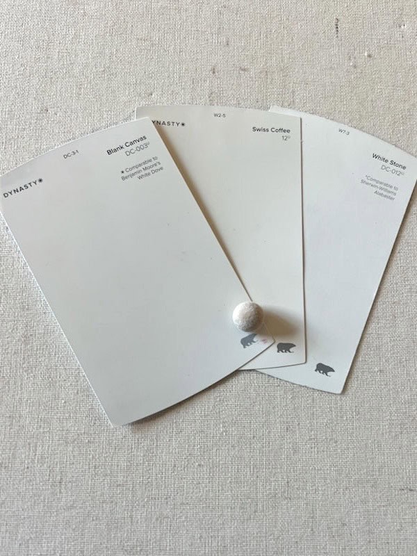

White paint sounds simple… until it isn’t. There are very few options for a “plain” white. Every white has an undertone, even if it’s extremely subtle like the first example.
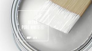

- ULTRA PURE WHITE – kind of self explanatory, but Behr’s Most neutral white. With RGB: 250, 250, 245, this is the closest you are getting to a true white.
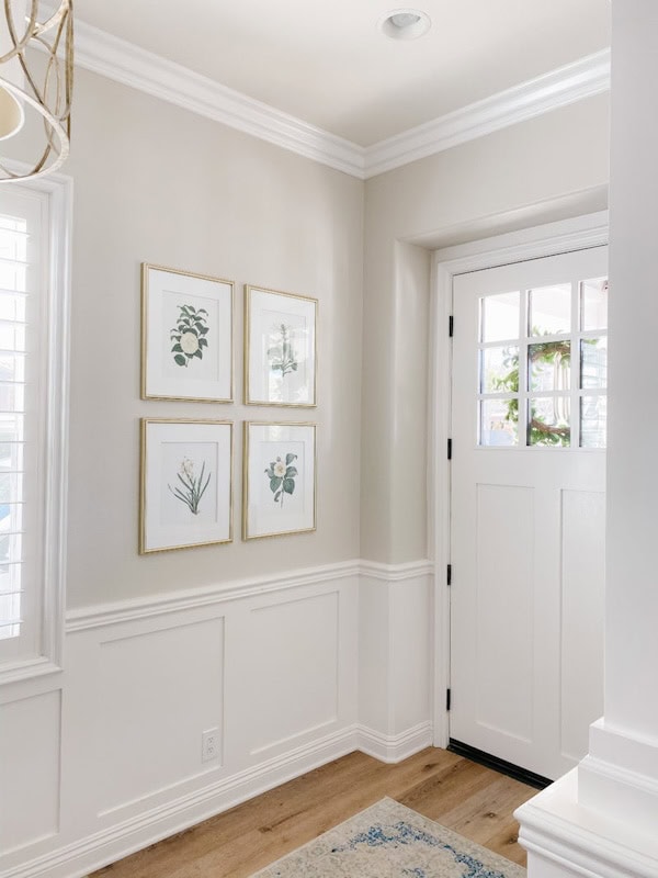
- Blank Canvas – 2023 Color of the year, between white and very light beige with a green undertone. More pure white than the two below.
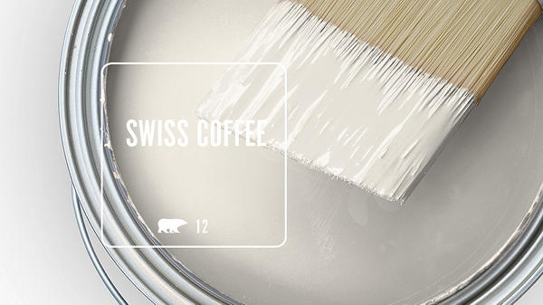
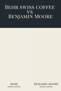
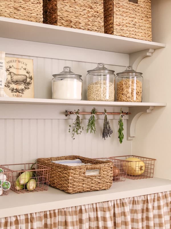
- Swiss Coffee – a warm white without feeling yellow. Behr’s version is a warmer deeper beige, while Benjamin Moore’s is slightly cooler with more gray or green undertones.


Source
Source
Source
Source
White paint reflects everything around it, from floors and cabinets to furniture and even what’s outside your window. With little pigment; lighting and surroundings show up more in white than they do in darker colors.
Behr Neutral Paint Colors

Neutral used to mean it sat right in the middle. no obvious warm or cool undertone. While today’s version of “neutral” is usually code for a light taupe that with a cozy warm tone.
- North-facing rooms can make them feel cooler, grayer, or slightly blue.
- South-facing rooms usually soften whites and help neutrals feel warmer and more balanced.
- East-facing rooms change the most throughout the day, so whites and neutrals that sit between warm and cool tend to work best.
- West-facing rooms, afternoon light can intensify undertones, pushing neutrals toward yellow, green, or gray depending on what’s underneath.


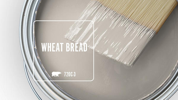
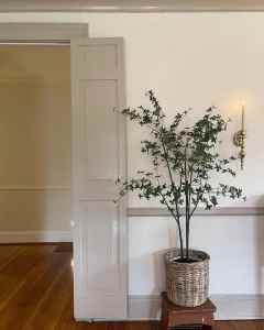
- Dove – light neutral that leans slightly cool, not a true gray and not a true white
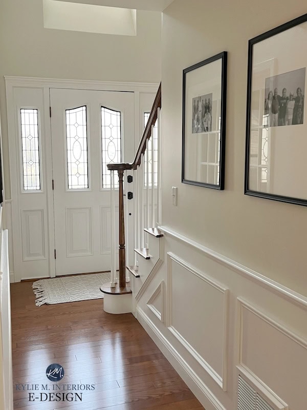
- Creamy Mushroom – is a warm taupe with subtle red and brown undertones
- Wheat Bread – a soft taupe with warm gray undertones making it not too warm or too cool.
Source

Source

Source
Neutrals are usually the trickiest for me, undertones don’t hide well. A little extra time with the sample on the wall might save a lot of second-guessing later.
Behr Blue Paint Colors

Most blues show their undertones more at night, especially under cool or daylight bulbs.
- North-facing rooms exaggerate blue undertones making them feel cooler.
- South-facing rooms soften a deep blue, so navy won’t look black.
- East-facing rooms work best with colors that are balanced between warm and cool, because blue will look warmer in the morning and cooler in the afternoon.
- West-facing rooms can push blue toward gray or green, a purple undertone will look gray in the morning and a yellow undertone will look green in the afternoon.


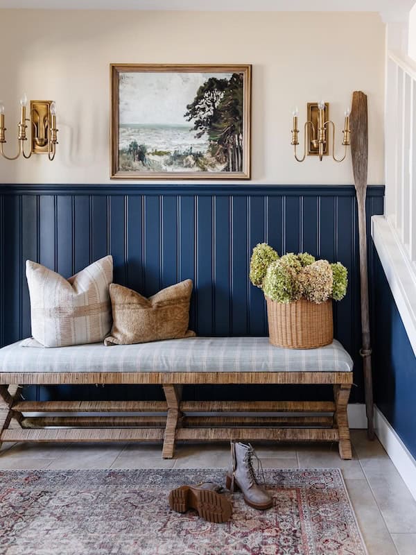
- Very Navy – A deep, classic navy that actually looks navy once it’s on the wall. This is usually the safest bet for a true navy.
- Adirondack Blue – A slate blue with cool gray undertones. It’s easy to pair with other colors, like a crisp cool white or a warmer soft beige.
- Light Drizzle – A soft blue-gray with a muted base that keeps it calm and flexible. It reads more blue or more gray depending on the light.

Source
Source

Source
Many “gray” paints are actually blue-based, which is why they can suddenly look blue once they’re on the wall. And Blue often hides in white paint, showing up only after lighting and reflecting other colors in the room.
Behr Green Paint Colors
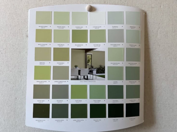
Most greens borrow from either yellow or blue, and that undertone shows up once the paint is on the wall.
- North-facing rooms can make green feel cooler or more blue-based especially in softer, muted shades.
- South-facing rooms bring out the warmth in green, which is why warmer greens like olive and sage look best here.
- East-facing rooms soften green in the morning but can muddy it later in the day, so pick a gray-green with a warm earthy base to complement the warm light.
- West-facing rooms intensify green, sometimes pushing it more toward yellow in afternoon light.


- Hidden Gem – Behr’s 2026 Color of the Year, a deep jade green with blue undertones that reads rich and moody without feeling forced or more natural.
- Royal Orchard – A deep green that shifts with the light, and looks velvety with an eggshell finish. It’s best in an East or West facing room.
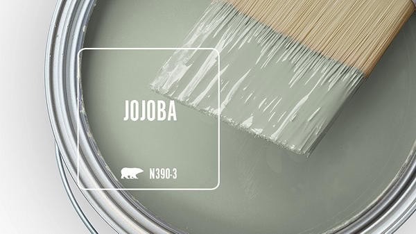
- Jojoba – A soft, light green with a strong gray base. It’s calming and easy to live with, especially if you want green without committing to a saturated color.
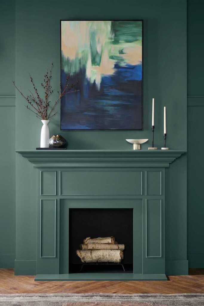
Source

Source
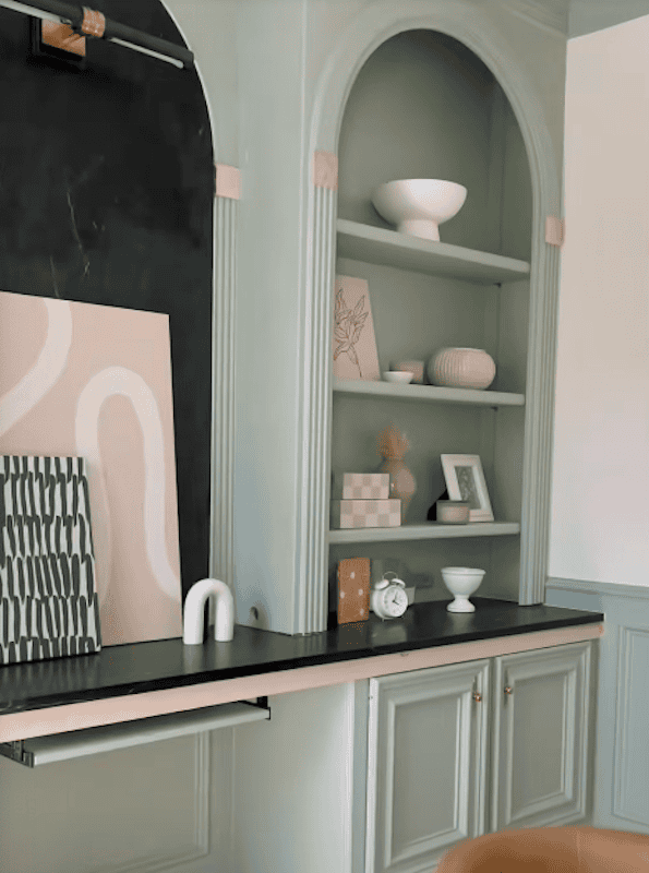
Source
Green is one of the most lighting-sensitive paint colors, which is why you should definitely wait more than 24 hours when testing colors.
A Few Standout Behr Colors from Previous Years


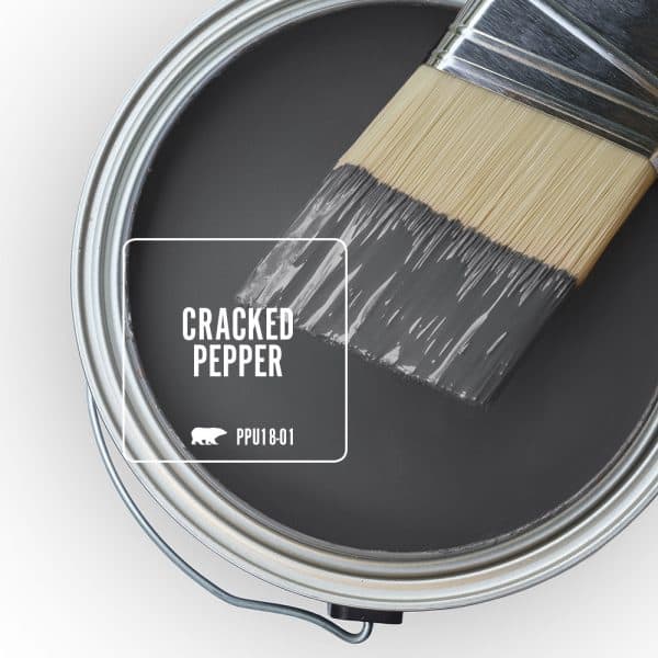
A soft black that’s actually easy to use. Its great if you are scared of going full black, especially in a darker room.
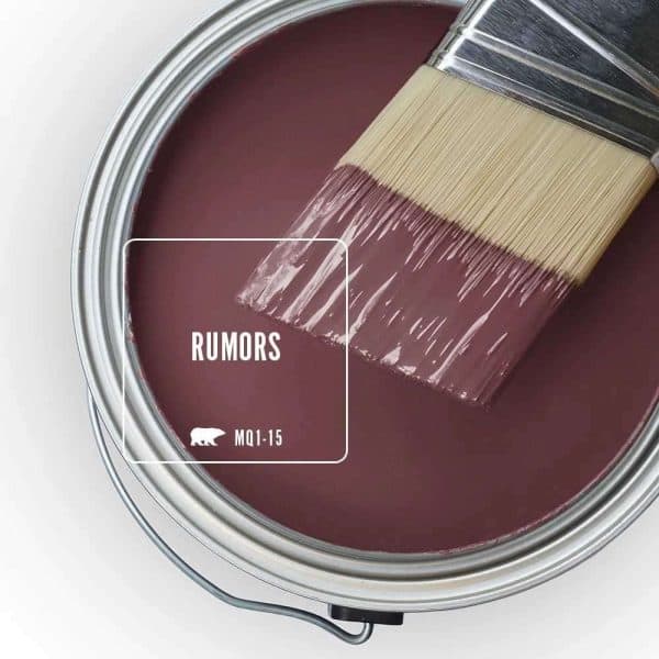
How to Read the Color Chip
Behr paint colors are labeled with more than just a name, each shade includes a specific color code used for mixing and matching paint accurately. While it can look confusing, only one code really matters when choosing or reordering paint.
Color Identification Code
(Under Color Name)
The color name isn’t always enough. Paint colors can have similar names, get reused across collections, or even change over time. The alphanumeric color code is what identifies the exact color and formula.
That code also makes it easier to get a match later. If you need more paint for touch-ups or another project, the paint store can use the code to pull up the same formula and mix the color again.
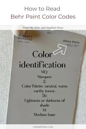
MQ2-56M
Tells you the collection, color family, hue, and darkness level.
“MQ” Behr’s Marquee family
“2” represents the color palette or collection
“56” to the lightness or shade variation within that color group
Paint Base (Tiny letters)
- U = Ultra Pure White base
- M = Medium base
- D = Deep base
Behr Paint Colors -FAQ
Blank Canvas is currently one of the most popular Behr paint colors because it’s a versatile neutral that works well everywhere. It has subtle warmth without looking yellow.
u003cspan style=u0022white-space: normal; caret-color: rgb(0, 0, 0); color: rgb(0, 0, 0); font-size: medium;u0022u003eBehr Swiss Coffee is a warm white paint color with creamy undertones. It works best in south-facing and west-facing rooms where natural light enhances its warmth.u003c/spanu003e
Blank Canvas has soft warm undertones without looking yellow or gray, making it one of the most versatile neutral paint colors.
Blank Canvas, Swiss Coffee, and Creamy Mushroom are excellent whole-house Behr paint colors because they work well in different lighting conditions and coordinate easily with other finishes.
Behr paint performs very well for interior walls and offers excellent coverage and durability. The best choice depends on your budget, color selection, and specific project.
What Actually Matters When Choosing Paint
It isn’t just about the shade, it’s about how that color reacts to light, direction, and everything else in the room. The reason these Behr paint colors stay popular is because they’re flexible, predictable, and easier to live with once they’re on the wall.
Take your time with samples and look at them throughout the day. When you understand how color behaves in each room of your house, choosing paint gets a lot less intimidating.
Before committing to a paint color, I always test a few options in the actual room lighting — ordering peel-and-stick samples makes the decision much easier.

What I Actually Use For All Painting Projects
After years of trial and error (and too many paint disasters to count), I’ve finally nailed down the must-have painting supplies that actually make the job easier. No streaks, no brush marks—just a smooth, professional finish.
Bonus: Grab Your Free Painting Guidebook
More Painting Projects and Tips
Projects, tutorials, tips and ideas you can use for your next paint project.



Something went wrong. Please refresh the page and/or try again.
Project Guides
Everything you need to plan and finish your project.














Leave a Reply