
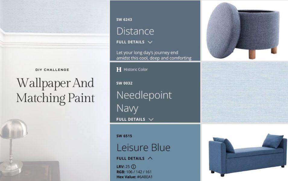
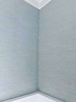
I needed to pick the perfect paint color to go with my son’s light blue grasscloth wallpaper. Matching paint and wallpaper sounds simple? It’s not. But don’t worry—I’ve got tips to make this process fun, not frustrating! You won’t second-guess your color choices. You also won’t regret the time spent staring at paint swatches for hours.

Go straight to
Disclaimer: This page may contain affiliate links. If you click on one of these links and make a purchase, I may receive a small commission at no extra cost to you. I only recommend products and services that I believe will add value to my readers. See our full Affiliate Disclosure at this link.

If you’re looking for your wallpaper and paint to match exactly, check out this quick video! It walks you through how to take a screenshot of a picture and use AI tools. You can use an image of your wallpaper and match paint or anything else in seconds.
Start With the Wallpaper (Not the Paint)
Usually wallpaper already has multiple colors built in—so let it lead.
Instead of trying to force a paint color you like, pull from what’s already there:
- Background color = safest option
- Secondary color = more depth
- Accent color = bold, but still cohesive

Most of the time, trying to match paint first just makes everything harder.
Shop My Wallpaper Favorites
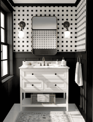
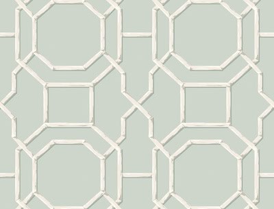
Some unique patterns you won’t see in everyone’s home
Geometric & Abstract


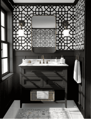
Floral and Fauna
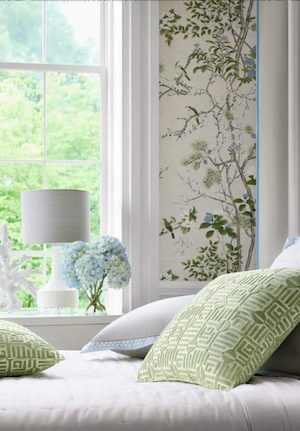
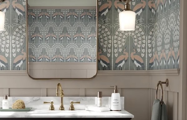

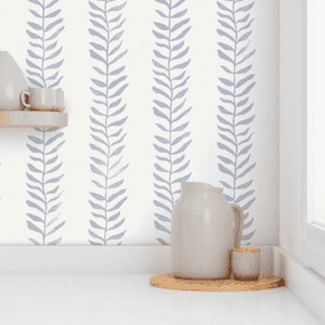


Grass Cloth


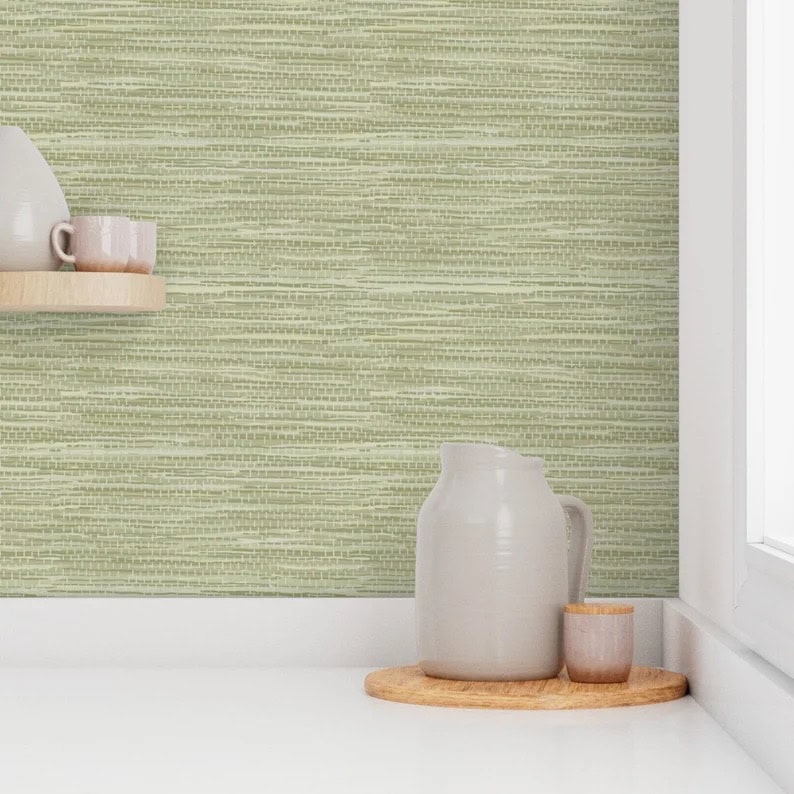

If the wallpaper feels peaceful, the paint should back it up, not compete with it.
Don’t Aim for an Exact Match
This is where most people go wrong.
Trying to match paint exactly to wallpaper almost never works. Even if it’s close, your eye will catch the difference—and it’ll look off.
A slightly different tone actually looks more intentional than a “close enough” match.

The Easiest Option (That Always Works)
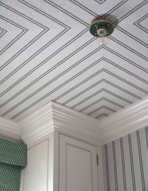
If you want this to look good with zero stress, match your paint to the lightest neutral in the wallpaper.
That could be:
- cream
- soft white
- light beige
- muted gray
This keeps everything cohesive without competing with the pattern.
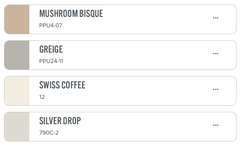
1. Neutral Tones
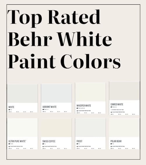
The chart below is from my Ultimate Paint Guide, these are the top picks from Behr from their neutral line.
Top Neutral Behr Paint Colors
How to Get the Paint Color Right (In Real Life)
Test Paint Colors to Match Your Wallpaper Before You Commit
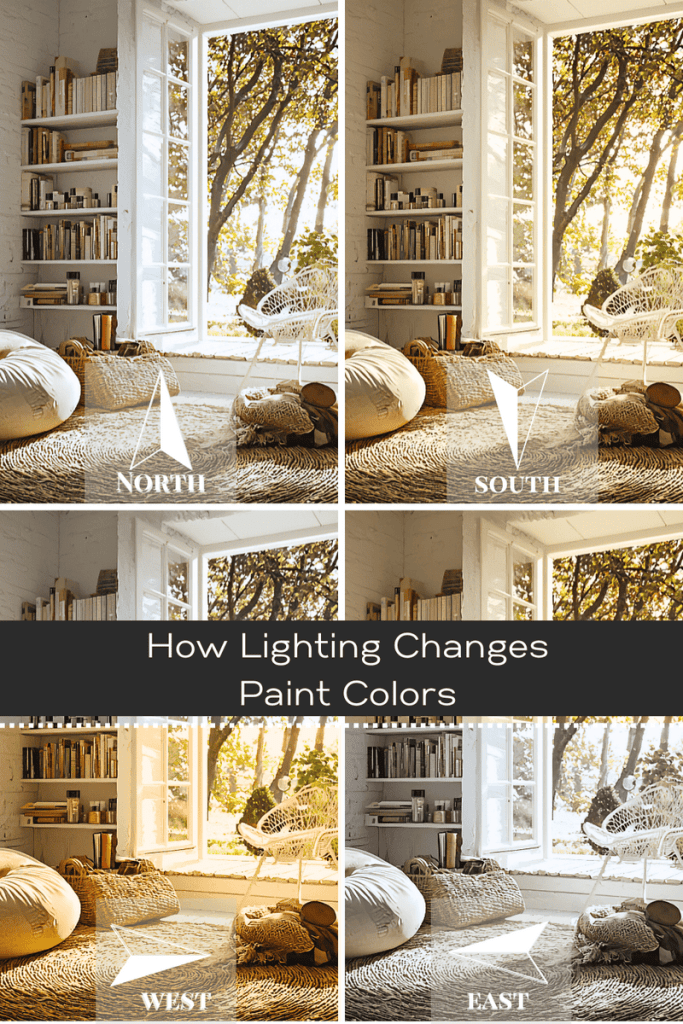
This part is crucial. There’s nothing worse than picking a color, slapping it on the wall, and then realizing you’ve made a huge mistake. Been there, done that, way too many times. Grab those paint samples and test them on the wall. Look at them under natural light, artificial light, and even at night. Colors can shift depending on lighting, and you want to avoid surprises.
Paint color doesn’t change. Lighting does.
So if something looks “off,” it’s usually not the color—it’s:
- lack of natural light
- warm vs cool lighting
- surrounding finishes
That’s why testing in your space matters way more than picking the “perfect” swatch.
Now I use Samplize to order peel-and-stick paint samples so I could test colors right on the wall next to the wallpaper. It made it way easier to see what actually worked in real light instead of guessing from tiny paint chips.
Picking a paint color isn’t as easy as just slapping something on the wall
You don’t need a perfect match—you need a color that works with the wallpaper.
If you keep it simple:
- pull from the wallpaper
- don’t match too closely
- test it in your actual lighting
…it’ll look right.
















Leave a Reply